
Hi, I’m Dave and I own a six-figure online business, The Blocks Agency. Enroll in my free Intro Course to Online Marketing and I’ll show you a simple path to running marketing for a online business.

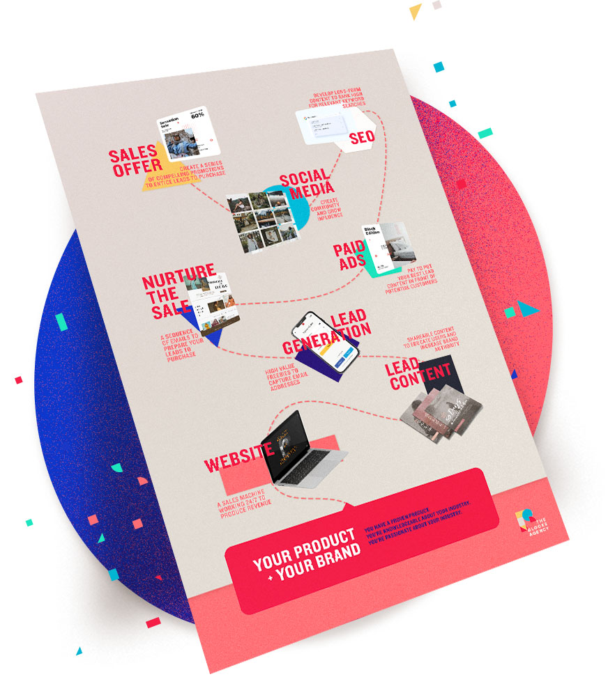
You shouldn’t have to hire an expert to market what you do best! My free intro course will give you a simple framework you can use to build a marketing plan — no matter your product or experience.
You don’t have to go into marketing your business blindly — and you don’t have to pay thousands of dollars to get the basics.
Enroll in my free School of Online Marketing and you’ll learn how to make money online.
© 2024 Dave Shrein — All Rights Reserved
My Intro Course to Online Marketing takes you through the process of developing your own plan to market your online business.